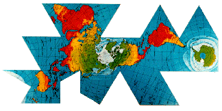
Fuller Projection
|
|
Fuller Projection |
|
|
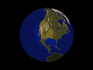
The Fuller Projection, or Dymaxion Map, solves the age-old problem of displaying spherical data on a flat surface using a low-distortion transformation. The map also shows the world's land masses without interruption -- the map's sinuses do not cut into the land area at any point. |
 |
|
The Fuller Projection is rendered by juxtaposing a grid of triangles on the globe and transferring the data to corresponding triangles on an unfolded icosahedron. |
|
|
Although the algorithm for transferring data from a sphere to a plane differs from previous icosahedral projections (the Gnomonic and John P. Synder's for example), Robert W. Gray has shown that the orientation of the icosahedron is the most visually distinctive aspect of the map. To the naked eye, the Fuller, gnomonic and Snyder projections are quasi-identical, once all are made to conform to the same trademarked layout. |
|
|
Fuller hoped that this map would be widely used for sharing global data, but discouraged people from marring it with national political boundaries. Fuller regarded sovereignties as holdovers from a bygone era, and dangerous obstructions to the maturation of a post-racist, post-nationalist civilization (see No Race, No Class, Desovereignization?). |
|
|
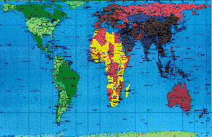
Perhaps owing to his anti-nationalism, Fuller's projection has never been favored by the United Nations, which instead promotes the Peters Projection as an alternative to the Mercator. The Mercator artificially amplifies the sizes of landmasses in a way which makes the industrialized, developed nations appear to account for a greater percentage of the total geographical area than they really do. Fuller's map actually introduces less overall distortion than the Peters Projection. |
 |
|
Synergetics on the
Web | |